Chunbo is a well-known online grocery service in China that was established in 2015. It rapidly gained popularity due to its commitment to providing safe, high-quality, and eco-friendly food, and its user-friendly digital service accessible across all platforms.
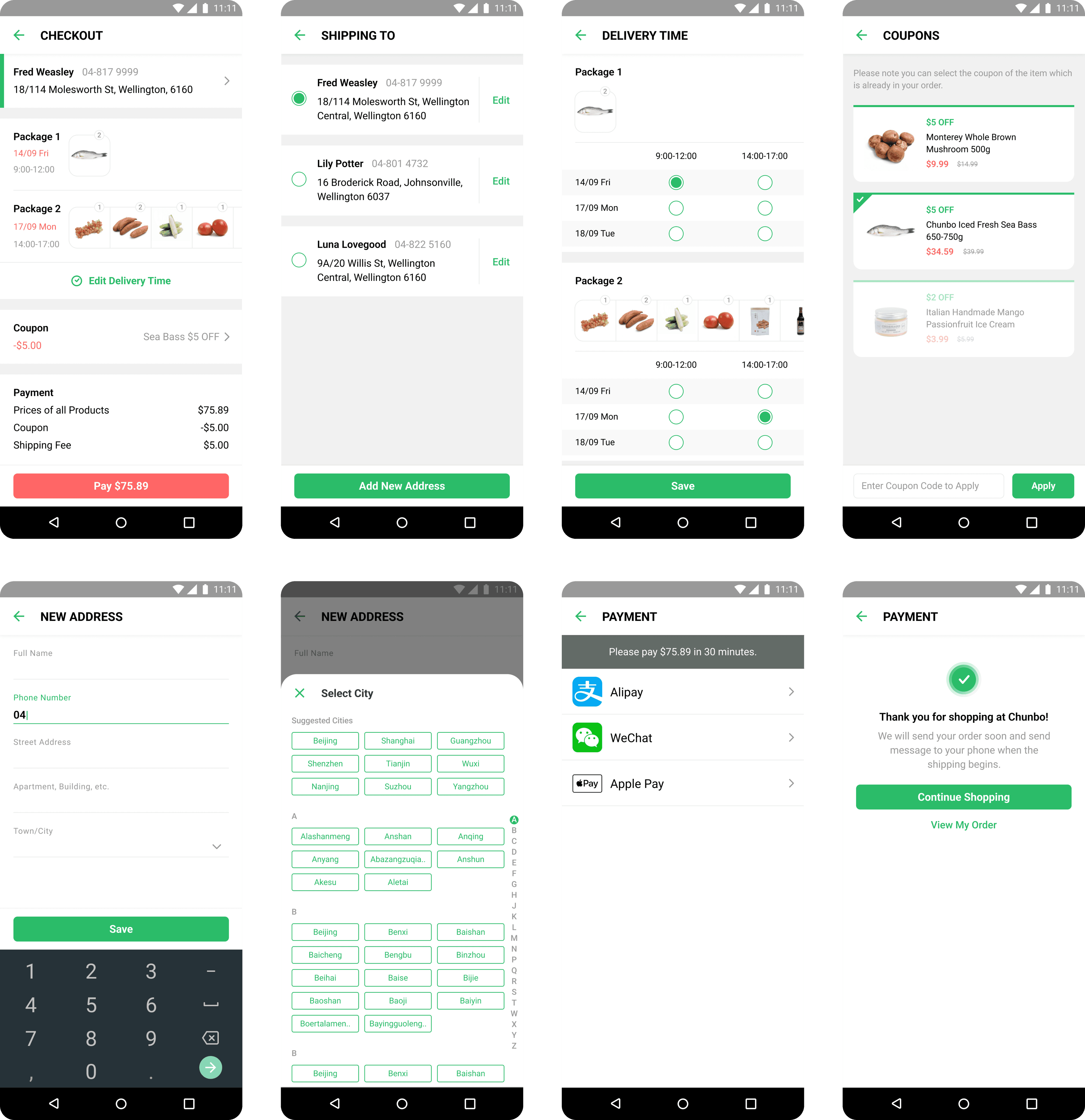
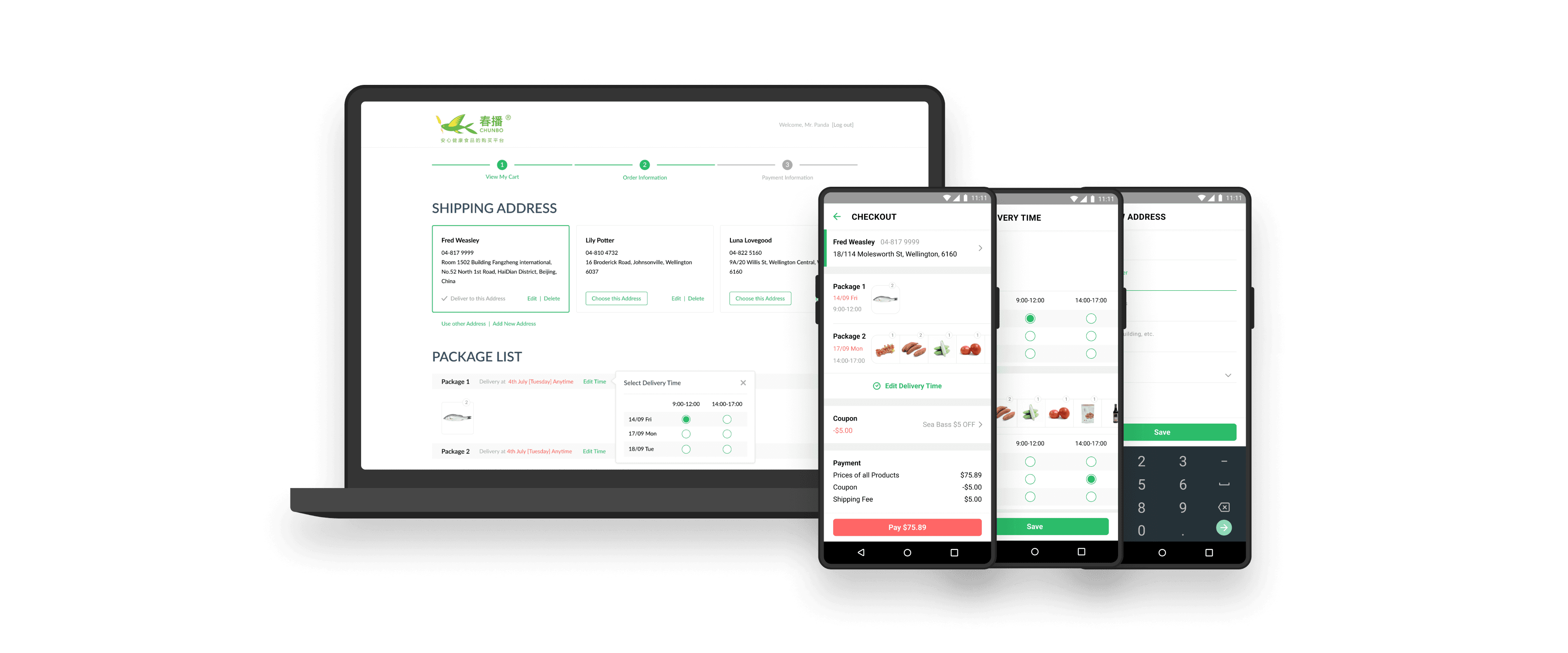
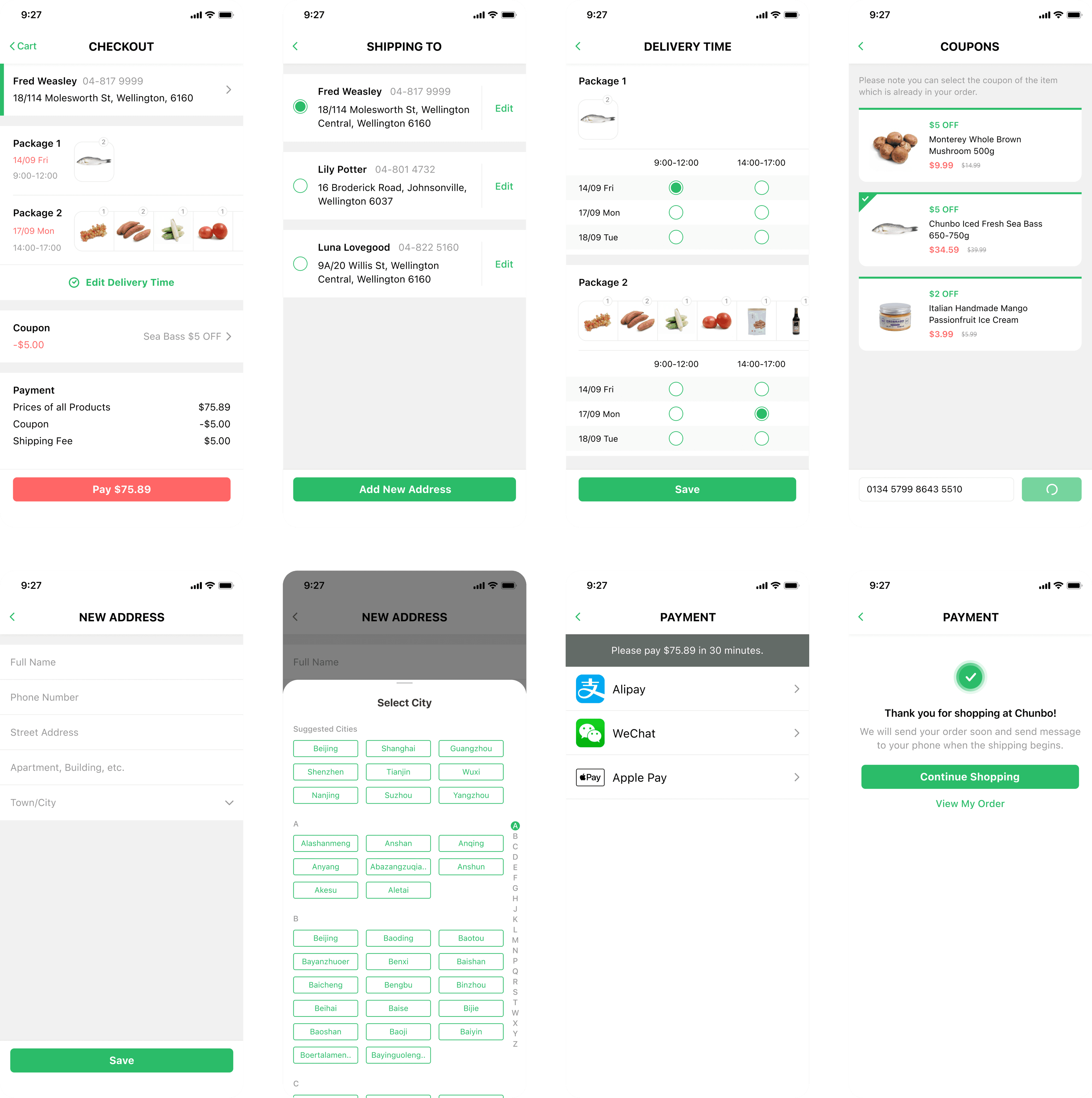
As Chunbo's business grew, it became pressing to establish additional warehouses at various locations to ensure efficient storage and delivery services. Due to the warehouse update, the customers may receive multiple packages from different locations after placing a single order.
Objective: this project will redesign the checkout experience across all the platforms, to help the customers adapt the change easily.
Organised workshop with the storage, delivery and customer service departments to understand the current conditions.
Conducted a user survey for better understanding what users care about during checkout.
Redesigned the checkout process for all the platforms.
Conducted an A/B testing to evaluate the effectiveness of redesign work.
Collected user feedback from the customer service department.
02.2 UNDERSTAND - OUR USERS
For better understanding what users care about during checkout, I conducted a user survey and got a result below:
Total price
Correct delivery address
Delivery date & time
The items in the order are correct (what and how many)
Discount (coupons)
The degree of importance for the customers decreases from top to bottom. Therefore, I started to have more clear thoughts about how to redesign it.
03 CONCEPTUALISE
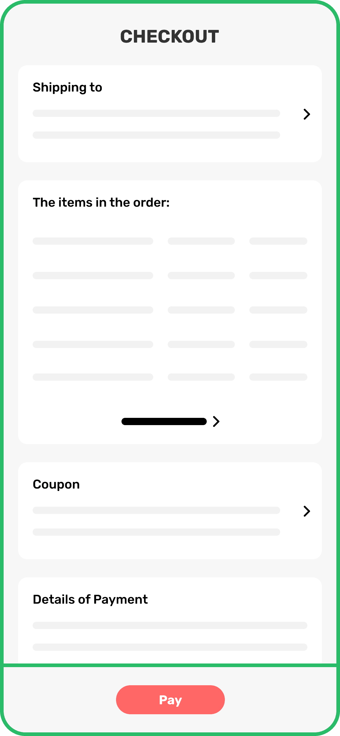
Then, I created a hybrid flow and wireframes of the checkout pages. Through this, I gradually clarify the scope and key points of the redesign work. In addition, this hybrid diagram helped the multiple teams and stakeholders experience the change from the customers' perspective.

03 DESIGN
I finished the visual solutions for the iOS app first because we planed to conduct a A/B testing for the checkout experience, and we picked the random users with iOS devices as they're the biggest proportion of the users of Chunbo.
After the user and business data showed that all good for this project, I finished all the left design for other platforms. I will put them at the end of this summary.
04 VALIDATE
I collaborated with the iOS and back-end developers to conduct a A/B testing for the new version of the checkout design compared with the previous one. I set a series of data we need to collect to see how the customers will adapt with the new delivery strategy with the new design. The outcome was better than we expected:
With new design, the finishing rate of check-out is near to 10% higher compared to the previous one.
After large proportion of testing users have received one package at least, the customers service team almost didn't receive any negative feedback about the new check-out experience.
We soon iterated all the online check-out service into the new design.
05 LESSON
Besides the experience of conducting A/B testing, here is another lesson I want to takeaway for my future design projects.
At beginning of design stage, I was very focused on using our components and staying within the design system. However, I realised that design system is an efficient tool and not a design goal in itself. I should consider what is actually best for our users. I learned sometimes I need to take a step back and think "Does this component make sense? Or do I need to change and create a new one for better?"
06 DESIGN OF WEB PLATFORM

07 DESIGN OF ANDROID APP