Learned and analysed user and business data.
Collaborated with the team to create UX deliverables and made problem statement to ideate and prioritise the possible solutions.
Developed information architecture and wireframes to implement the design strategy and guide the visual design at next phase.
Executed the visual design phase with creating a consistent and efficient design system to ensure consistency across all deliverables.
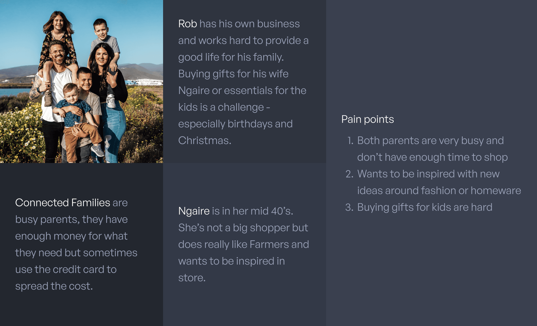
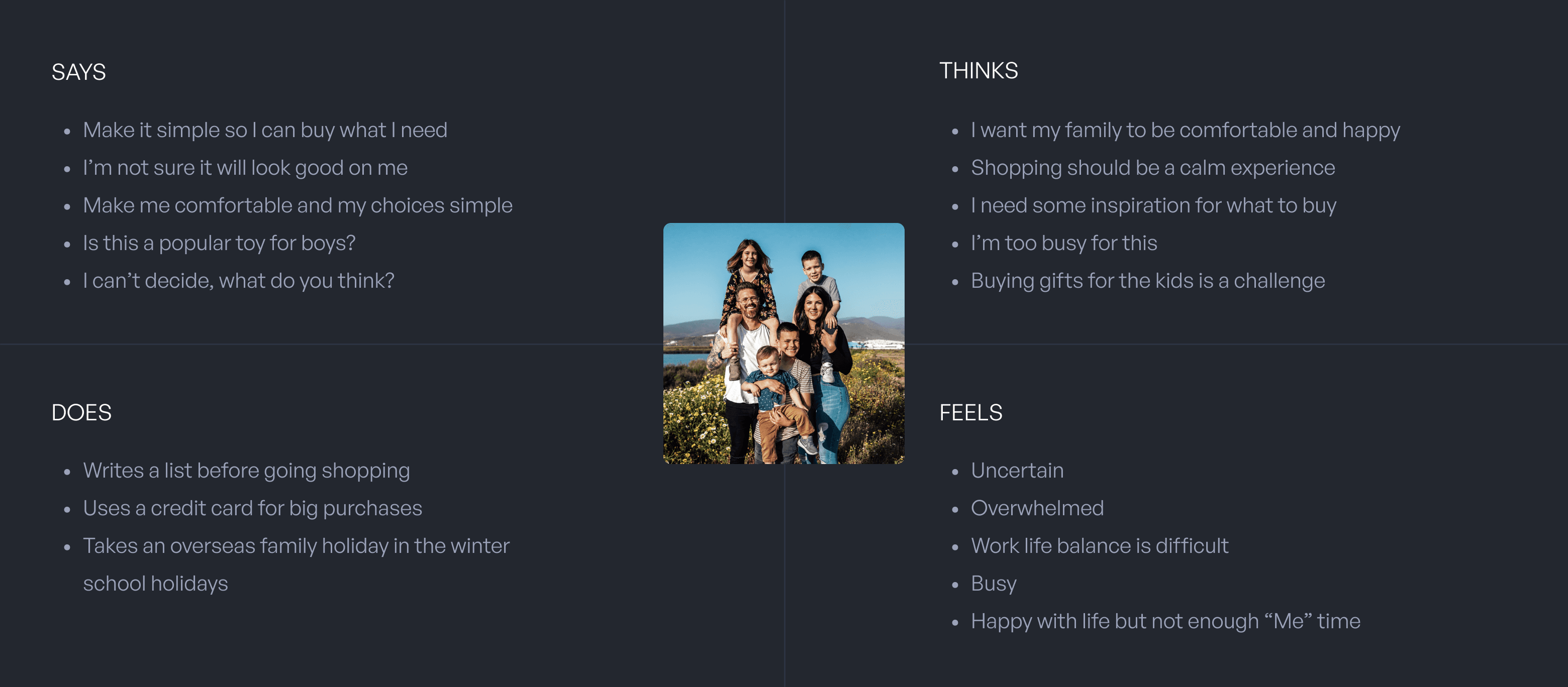
We also created an empathy map for the Connected Families group to understand them deeply. Besides, it helped to share our insights with stakeholders and guide the next ideation phase.
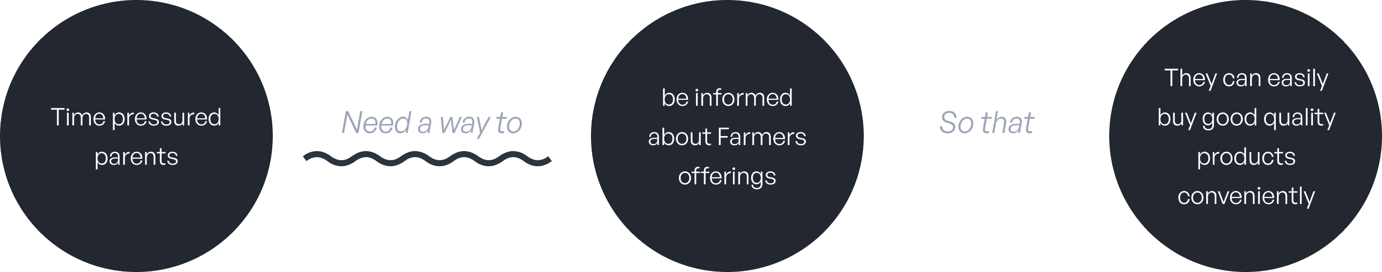
Then we defined the problem statement for the target user group based on the results we got, to stimulate creative solutions for a better user experience. For example:
Digital Farmers Club card - scan at POS
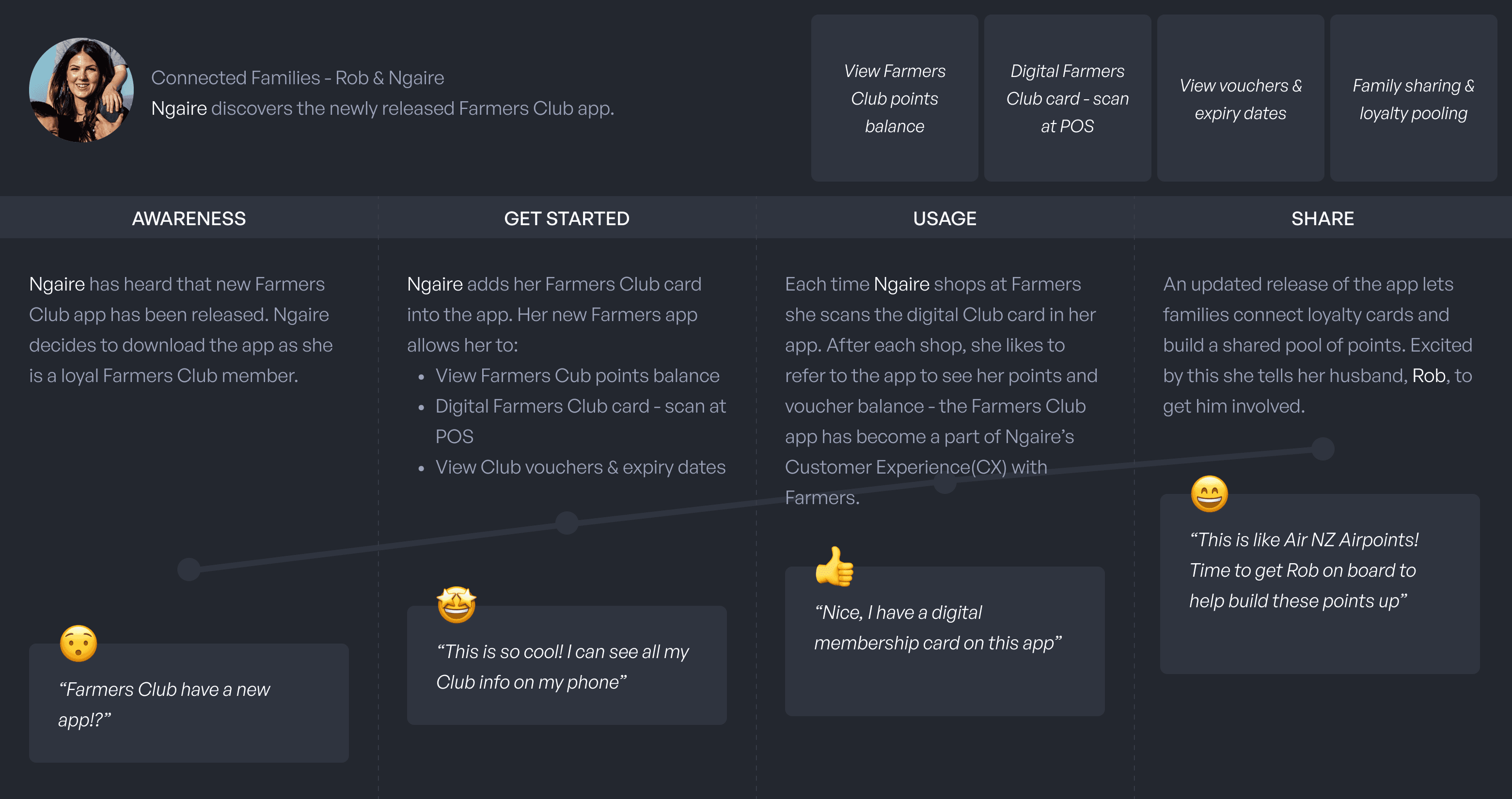
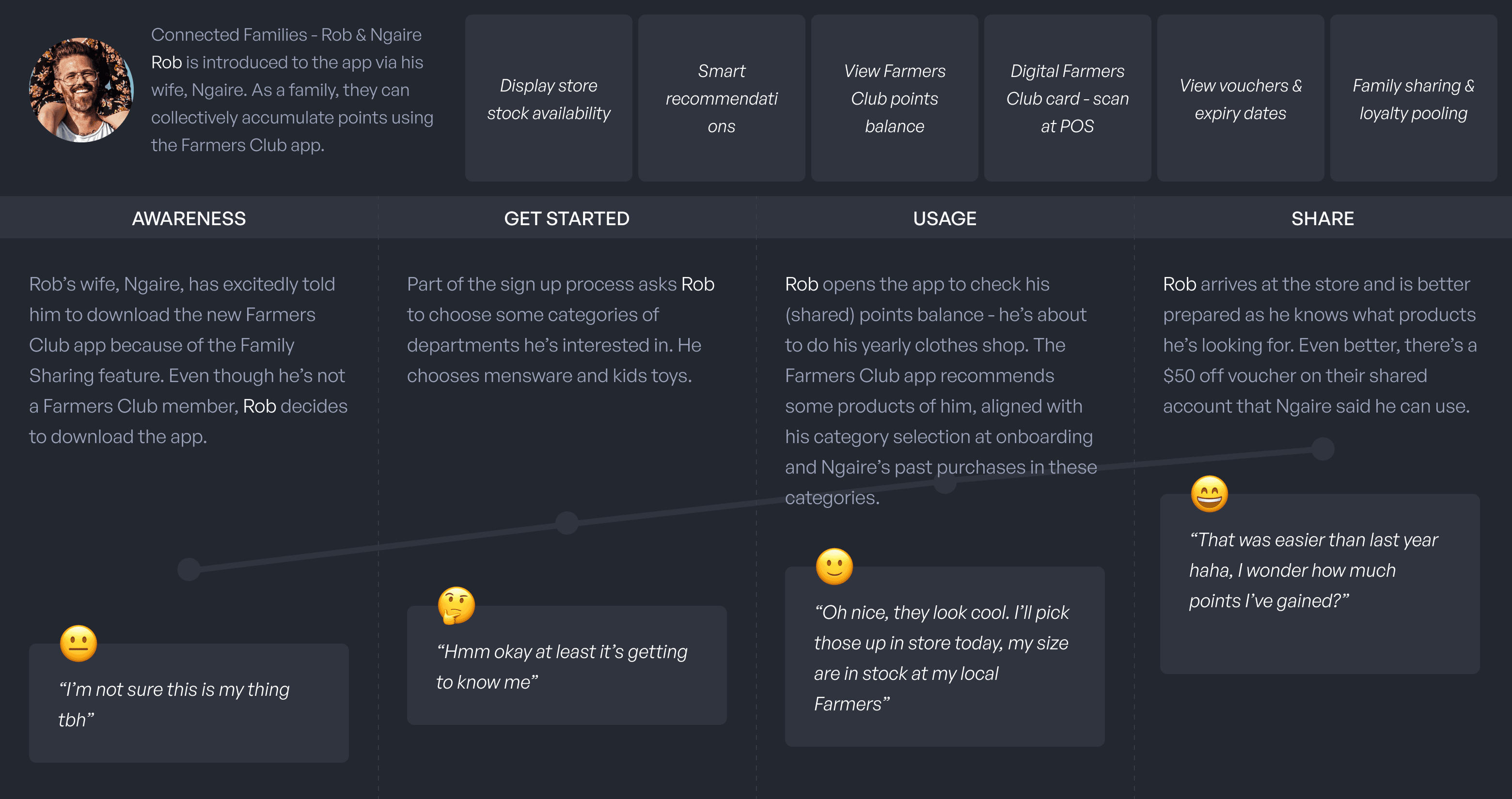
Before going into design phase, we used journey maps to visualise our core user experience - noting various touch-points and potential emotional responses. These are the two user journeys for our persona persons:
03 DESIGN
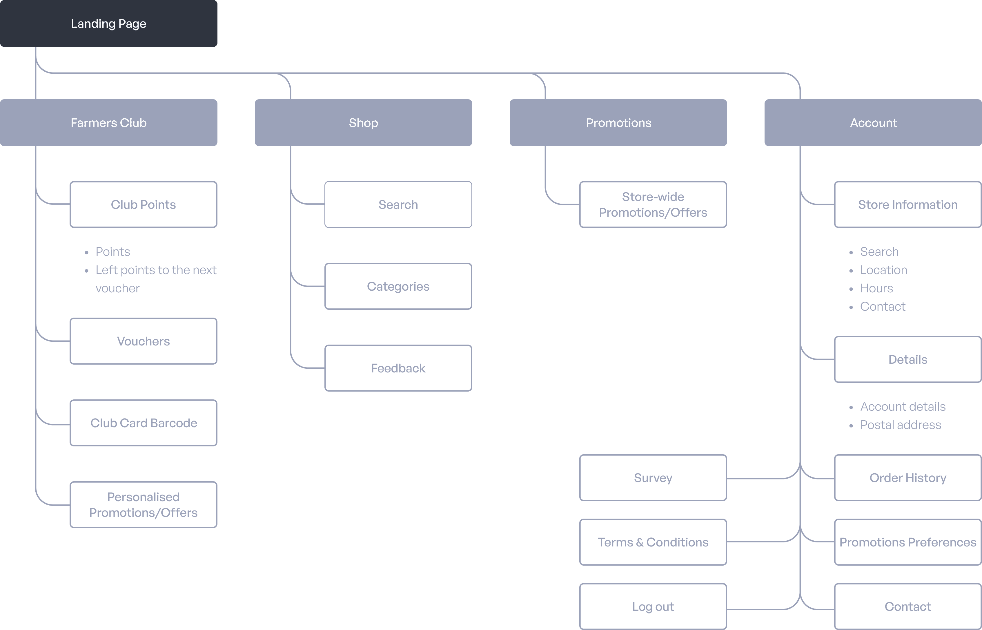
Based on priority and how the solutions serve the user journey, I created an information architecture to confirm all the pages and features for the first version, to help me have a clear mind for the whole scale and still have ability to focus on the detail design in next step.
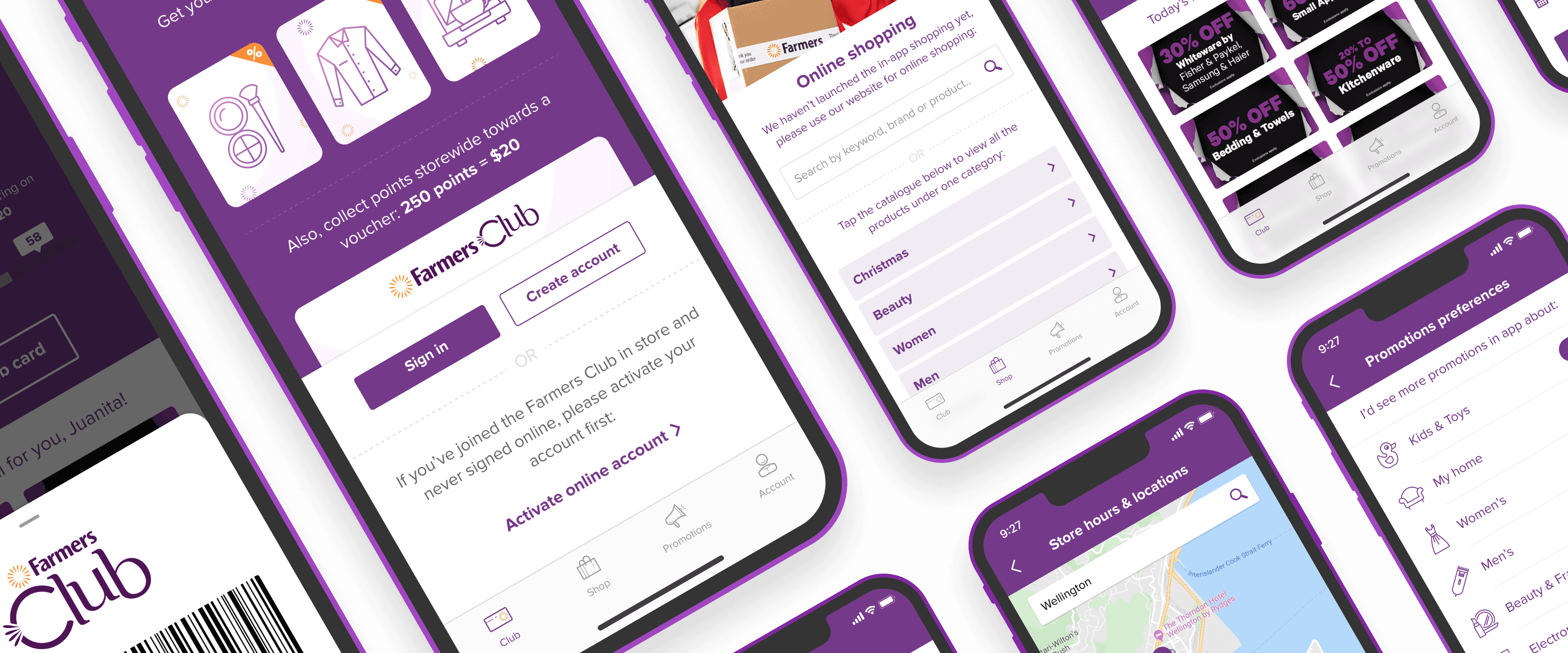
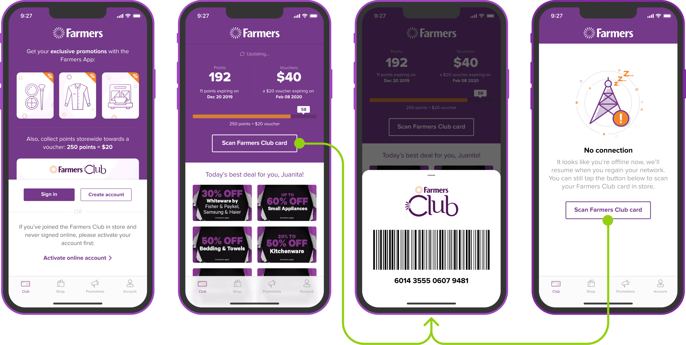
As Farmers has lots of physical stores, the Farmers Club app must adapt with the user experience in store. So, I created wireframes with flow for logging experience in app to make sure it could serve all kinds of scenarios.
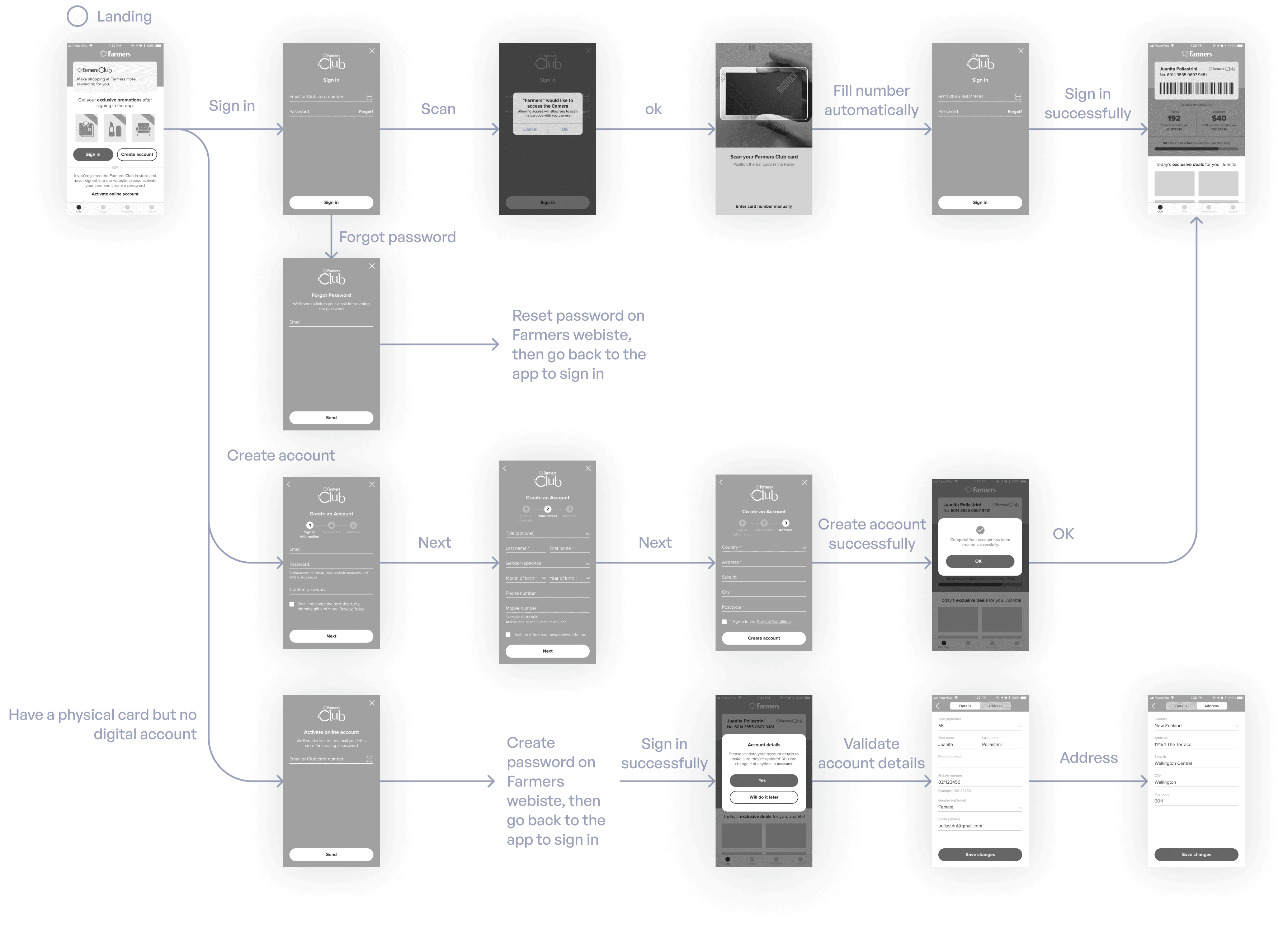
And after logging into the app, the left screens with flow are:

After all the details has been considered, I started to do the final interface design. To provide a seamless and consistent user experience across the existing Farmers website and the newly developed Club app, I ensured that the visual design of the app aligned with the Farmers branding, including the fonts, the colours and the graphic elements everywhere. Additionally, I built a clear and consistent design system to allow our font-end developers to build the UI more efficiently.


During the final design, I asked myself several questions to help me focus on key aspects to see how interface could help user finish their tasks.
For "sign in and land to the club info" phase:
What does the customers want, before and after landing into the app?
What does the customers care most when they check their Club card?
How to help user scan their Club card at store? What if phone wasn't online?
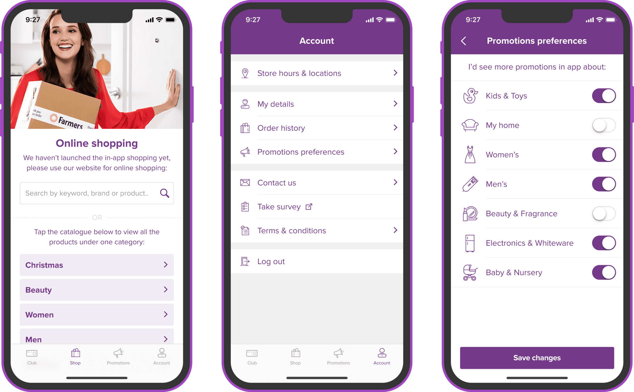
About shop, account and promotions preferences, the questions I asked myself:
What are the proper entrance to take users to shop at the Famers website?
How to deliver the basic promotions management in this version?
What's the essential features for an e-commerce account?
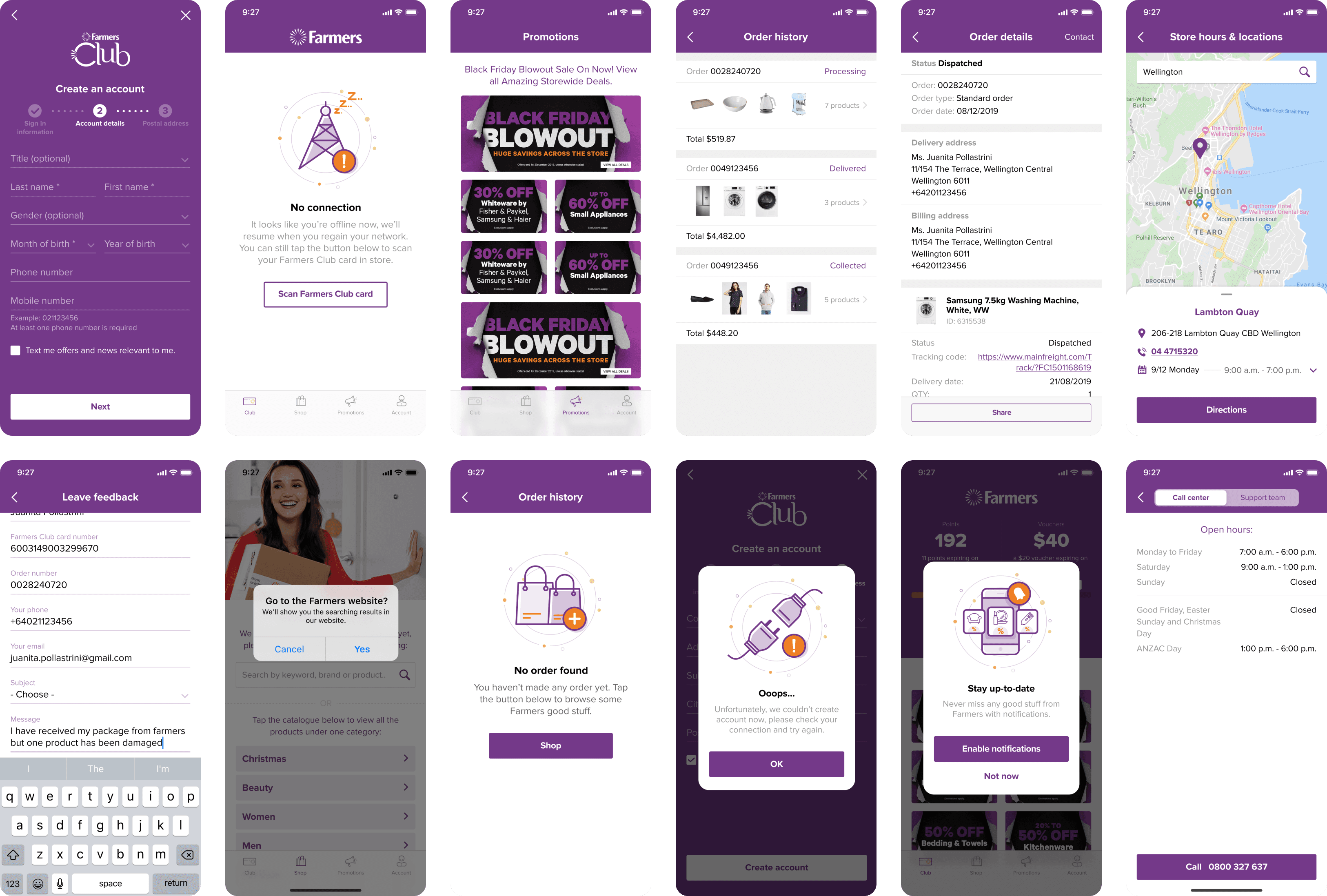
After finishing all the primary screens, I crafted the left pages one by one.
04 VALIDATE
After all the hard work, there were 2 highlights we got:
The client expressed great satisfaction with the final delivery, and gave the final result a very good evaluation.
Although this project wasn't launched immediately due to the projects coordination issue inside Farmers company, this is a good project to implement a solid UX design process and make a summary to learn and share.
05 NEXT
Conduct user testing and update design work.
Collect user data and feedback to guide the next version iteration.
Finish the solutions with lower priority which were ideated in the previous conceptualisation phase.